Picnic
Picnic is the built-in theme that ships with Plate. It is minimal by design — clean typography, a subtle gingham grid background, pinned-photo thumbnails, and a soft shadow treatment on content cards. It works out of the box with no configuration required and serves as the fallback when no other theme is active.
Picnic is also the reference implementation of the theme contract. If you are building a custom theme, Picnic is the best starting point.
Screenshots
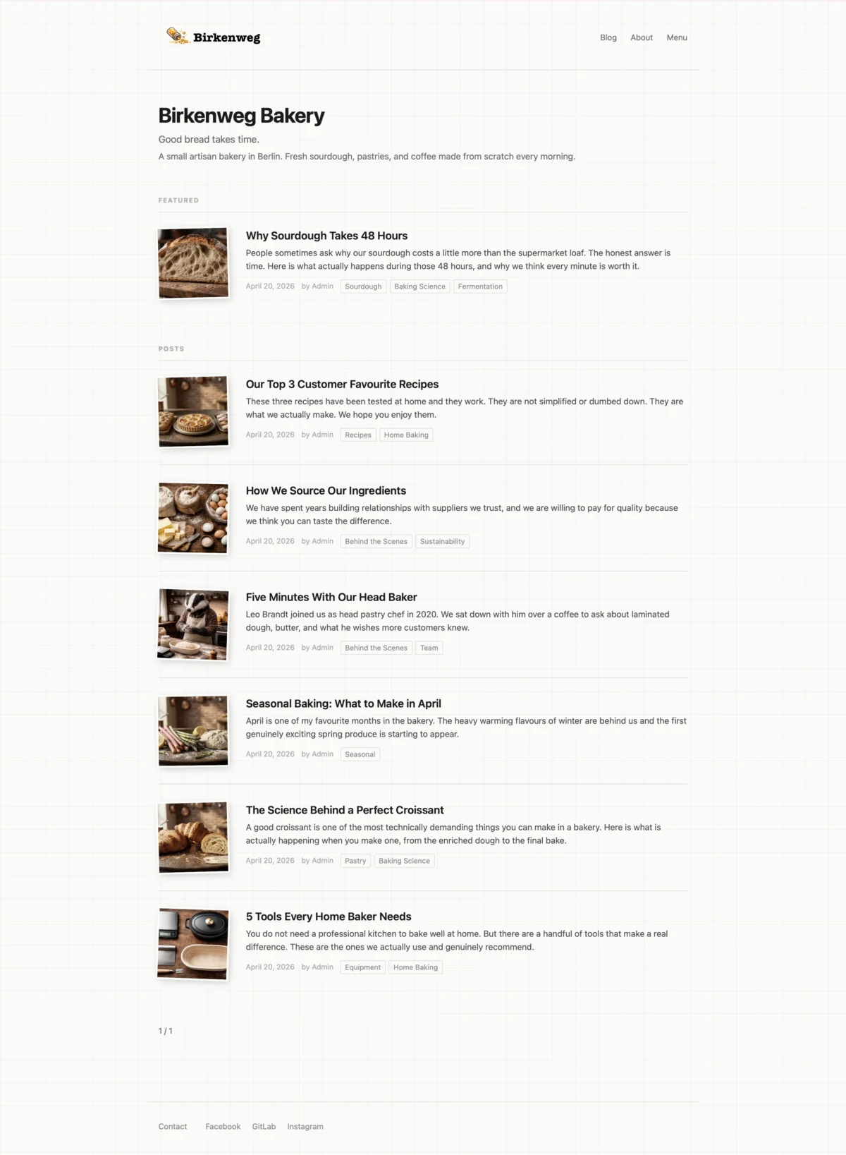
Home page — featured post section, post listing with thumbnails, tags, pagination, and social links in the footer.
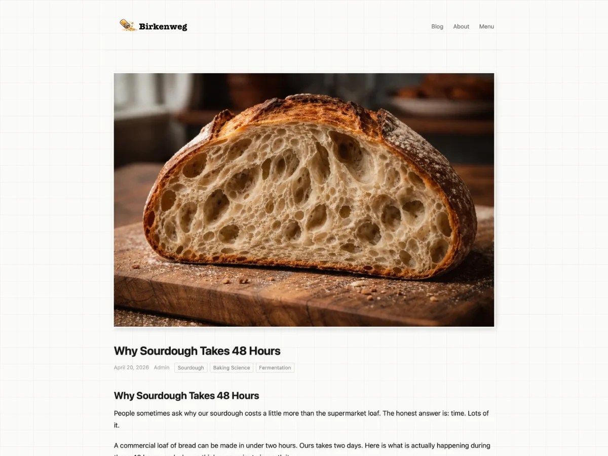
Post — top — hero image, title, author, date, and tags.
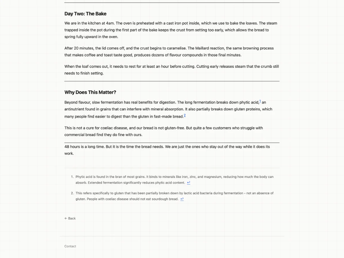
Post — bottom — section headings, body text, footnotes, back link, and footer.
Activating Picnic
Picnic is the default fallback and requires no explicit configuration. To pin it regardless of Snackbox settings, set THEME_NAME=picnic in your environment (see docs/ADMINISTRATOR.md).
To select Picnic from Snackbox, set the active theme to picnic in your Snackbox site settings. Plate will hot-reload it without a restart.
Settings
Picnic defines theme settings primarily to showcase how the theme settings feature works for theme developers. They demonstrate the available setting types (color, boolean, string, number) and how a theme can declare defaults and descriptions in manifest.json.
| Setting | Type | Default | Description |
|---|---|---|---|
accentColor | color | #2563eb | Primary color used for the site title and interactive elements. |
showExcerpts | boolean | true | Show post excerpts on listing pages. |
footerText | string | (empty) | Optional copyright line or tagline shown at the bottom of every page. |
contentWidth | number | 960 | Maximum width of the content area in pixels. |
maxFeaturedPosts | number | 2 | Maximum number of posts shown in the Featured section on the home page. |
dateFormat | string | long | How dates are displayed on posts. long = full month name, short = numeric. |
For how theme settings work and how to define them in your own theme, see docs/THEME-DEVELOPER.md.
Design details
Gingham grid — The page background uses a subtle CSS gingham pattern that gives Picnic its distinctive texture without competing with content.
Pinned-photo thumbnails — Post thumbnails on listing pages are fixed-size and cropped, so the list stays visually consistent regardless of image proportions.
Shadow treatment — Content cards carry a soft drop shadow that lifts them off the background grid, creating a clear visual hierarchy between chrome and content.
Typography — Body text uses the system font stack. Headings are set in a heavier weight of the same family, keeping the design coherent across platforms with no web font requests.
Using Picnic as a starting point
Picnic's source lives in src/themes/picnic/. The quickest way to start a new theme based on Picnic is to copy the directory and adjust from there:
cp -r src/themes/picnic /your/themes/dir/mytheme
Then update manifest.json with your theme's name and details. See docs/THEME-DEVELOPER.md for the full theme development guide.